
This post has been getting a lot of hits. I thought I would repost it. It is great information.
And HECK I LOVE COLOR!!
(and Yes Dad you did see this post before)

I continued expressing my color obsession by always choosing bold colors. I have had bright blue bathrooms, bright yellow bedrooms, blue painted floors, gold rooms, red rooms and more. I honestly think I have used the entire color wheel in my many years of home decorating. When I started interior design school last August I was so thrilled to sign up for Color theory. I couldn't wait to learn more about color.
I remember feeling pretty innocuous after attending my first class Color Theory class. However as the saying goes "Ignorance is bliss". It was a good thing I didn't know what was in my Color Theory future in terms of work load. In the end I am so thankful for that work load because I learned so many important things that are imperative to the success of color in design.
One of the most important elements of a well designed space is the use of color. There have been many times I have walked into a room and I could see that something wasn't right. I have learned that many problems of color in design are because color relationships were not understood or simply ignored. A simple lesson in understanding the Color Wheel and color relationships can help in picking out colors.
If you don't own a color wheel do yourself a favor and get one. They can be found at any art store or craft store and the investment of the few dollars can save you lot of headache. From now on I will always be carrying with me a Design Kit which will contain many simple but essential things to do my job and the most important thing will probably be that Color Wheel.
One of the very first assignments in Color Theory was to create a Color Wheel. It sounded simple enough until you realized you could only use 6 acrylic colors in addition to white and black to create all of the colors of the Color Wheel. I spent many hours mixing colors to get an exact match to the purchased color wheel. The assignment came with no instructions on what colors to mix together to get the match so it was purely trial and error. I learned very quickly to keep track of what colors I mixed together to get a certain color. I also learned that I became less accurate the longer I worked with the colors. But in the end I did create a color wheel that matched the purchased color wheel. It wasn't perfect but it was close and I received a 96 out of a 100.

I wish we would have been allowed to create a Color Wheel in abstract like Kandinsky did here. Isn't the relationship between the colors stunning?

If you understand the relationships between the colors on the wheel and adhere to a few simple guidelines it will help when you pick out color schemes for your home.
It is simple enough to understand primary colors which are
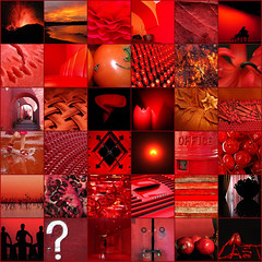
Red
Yellow
 Image by Vicki's Nature via Flickr
Blue

Secondary Colors which are Orange, Green and Violet are made by mixing two primary colors. Tertiary Colors are Red Orange, Yellow Orange, Yellow Green, Blue Green, Blue Violet and Red Violet. Tertiary colors are made by mixing a Primary and a Secondary Color. The basic colors of the color wheel starting at the top are Red, Red Orange, Orange, Yellow Orange, Yellow, Yellow Green, Green, Blue Green, Blue, Blue Violet, Violet, and ending at Red Violet. I fondly refer to the colors in this cool little code now ie: Red=R, Red Orange=RO, Orange =O, Yellow Orange=YO.....and so on. It is little like Color short hand.
The next thing to understand are the terms of analogous, complementary, split complementary, monochromatic, Tetrad, Triad. In my next several blogs I will go over these terms and share with you images of spaces that have incorporated these color schemes.
Check out these amazing spaces. See if you can figure out what type of color scheme was used.


Mary McDonald


3 comments:
Learning your lessons well, I see! Nice post.
Hi Carla. I learned so much this last semester. I can't wait for this long winter break to end so I can get back to business!!
Hi Deb, Isn't Tobi great with her color schemes. I remember making my color wheel the same way you did. After many trials and errors it turned out ok. I like that you go in depth about the colors on the wheel. if people understood it a little better, they wouldn't go wrong with color selections.
Post a Comment